Sidebar: Difference between revisions
No edit summary |
|||
| (One intermediate revision by one other user not shown) | |||
| Line 50: | Line 50: | ||
At the bottom of the sidebar you find the link "[[Rests of components]]", which allows inserting e.g. the power supplies or other component fragments which normally are treated separately. As far as you do not have a certain component at hand locally, you may use the component search which widens the search to the component server (online)[[Image:sidebars6_e.jpg]] | At the bottom of the sidebar you find the link "[[Rests of components]]", which allows inserting e.g. the power supplies or other component fragments which normally are treated separately. As far as you do not have a certain component at hand locally, you may use the component search which widens the search to the component server (online)[[Image:sidebars6_e.jpg]] | ||
<br><br> | |||
==== Context menu II ==== | |||
With the right mouse button '''[[M2]]'' on an icon you can open the following context menu:<br><br> | |||
[[Image:sidebar_buttons1_e.jpg|none]]Image: Context menu for part symbols<br><br> | |||
This allows you to open the '''[[component database]]''' to directly find the selected component family and the component alternatives contained therein. Or you can '''easily '''add your own standard parts to the pictograms'' of the sidebar. | |||
The context menus of the component buttons in the sidebar also collect the user's favourite components. For example, all resistors searched for via this button are stored in the context menu of the resistor button. The list contains a maximum of 20 components and of course the most frequently used components are listed above. The time that has passed since the last use also plays a role. This way you have all your favourite components immediately at your mouse without having to open the big component browser. | |||
== The sidebar in the layout view == | == The sidebar in the layout view == | ||
| Line 67: | Line 75: | ||
=== The section Layers === | === The section Layers === | ||
[[Image:sidebarl3_e.jpg|left]]The section Layers | [[Image:sidebarl3_e.jpg|left]]The section Layers stands for the small layer tool which was fixed to the right side of the screen. You determine here which layer you want to fade in or out. What do you want to draw upon which layer? Here you do the right selection and toggle quickly. | ||
==== Layer for lines, circles etc. ==== | ==== Layer for lines, circles etc. ==== | ||
Here you determine upon which layer you are going to use the drawing tools for lines circles and other drawn figures. Mainly this will be non-copper layers. Sure you can draw any figure upon copper either. But | Here you determine upon which layer you are going to use the drawing tools for lines circles and other drawn figures. Mainly this will be non-copper layers. Sure you can draw any figure upon copper either. But on copper itself you will normally draw signal tracks, solderig pads, vias and copper pour areas (e.g. GND). Lines, Circles and other "painting" elements in most cases will be drawn upon non copper areas.<br>The active layer for drawing items '''is highlighted in gray'''. | ||
==== Layer for tracks ==== | ==== Layer for tracks ==== | ||
By default layer 2, copper bottom, and layer 16, copper top, will be used for all copper elements. You also might click '''[[M1]]''' on a link and open a selection board to select the copper layer you wish to use.<br>The active copper layer | By default layer 2, copper bottom, and layer 16, copper top, will be used for all copper elements. You also might click '''[[M1]]''' on a link and open a selection board to select the copper layer you wish to use.<br>The active copper layer for copper tracks '''is highlighted in copper-color'''. | ||
==== Activate a layer for drawing on ==== | ==== Activate a layer for drawing on ==== | ||
By clicking '''[[M2]]''' on a layer number you will activate the layer | By clicking '''[[M2]]''' on a layer number you will activate the layer. The active layer appears highlighted with a badge in gray or in copper-color. | ||
==== Programming buttons for layersets ==== | ==== Programming buttons for layersets ==== | ||
Latest revision as of 11:55, 15 July 2020
General
Main functions of schematic and layout are offered within the sidebar on the right hand side. You may move the sidebar to any appropriate place on your screen and use it by drag and drop. In the layout view it looks a bit different than in the schematic view:
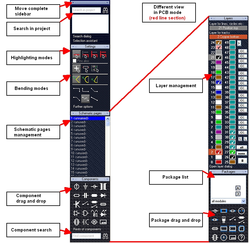
The sidebar look in the schematic view (left) and in the layout view (right)
The sidebar in the schematic view
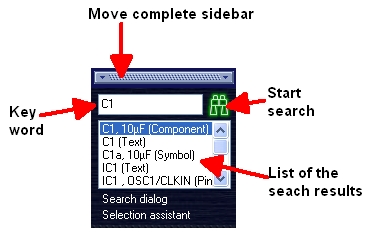
On top you see a bar for moving the complete sidebar. below there is the "project search" which allows to search for particular elements in your project. You may enter the keyword into the search field. Then click on the binoculars for getting all matching elements listed. Click on one element from the list which gets centered and highlighted. The text link "Search dialog" opens the well-known search dialog. The textlink "Selection assistant" opens it. Please also note the buttons "Settings", "Schematic pages", and "Components" each rolling up sections for further use.
.
Section Settings
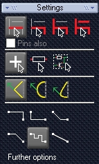
These are the buttons of the former pointer toolbar. New is the option for highlighting the connections (pins) too (see checkbox "Pins also"). Furthermore the bending modes for the placement of wires can be selected. please note the Schematic router . It is represented by the icon: ![]() It places several signal wire segments (pin to pin) at the same time. By the link "Further options" you will open the dialog "TARGET preferences and options".
It places several signal wire segments (pin to pin) at the same time. By the link "Further options" you will open the dialog "TARGET preferences and options".
Section Schematic pages
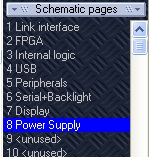
It's the place where you easily administrate your schematic pages. A click M1 on a line allows naming of a schematic page. M2 upon a line allows: Rename page, Move page, Delete page. The contents of a page can easily be brought to another page by copy and paste. If you hold a line by the mouse (M1H) you can drag it to a different position in the row.
Section Components
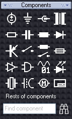
Drag and Drop
If you hover the mouse over one of the pictograms it will glow in green. Now press M1H and drag the component symbol which is represented by the pictogram to your schematic canvas. At an appropriate spot you drop it by releasing the mousekey.
That's the default setting of the left mousekey M1. Using the right mousekey M2 on a pictogram will open a kontext menu.

It enables you to Open the Library Browser, for browsing the component's family and for searching appropriate alternatives. Easily you might furnish the glowing icons with your own default components by using the entry "Determine standard component".
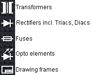
The pictograms have the following meaning:
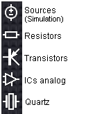 |
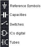 |
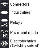 |
|
At the bottom of the sidebar you find the link "Rests of components", which allows inserting e.g. the power supplies or other component fragments which normally are treated separately. As far as you do not have a certain component at hand locally, you may use the component search which widens the search to the component server (online)
With the right mouse button 'M2 on an icon you can open the following context menu:
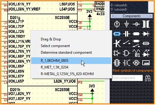
Image: Context menu for part symbols
This allows you to open the component database to directly find the selected component family and the component alternatives contained therein. Or you can easily add your own standard parts to the pictograms of the sidebar.
The context menus of the component buttons in the sidebar also collect the user's favourite components. For example, all resistors searched for via this button are stored in the context menu of the resistor button. The list contains a maximum of 20 components and of course the most frequently used components are listed above. The time that has passed since the last use also plays a role. This way you have all your favourite components immediately at your mouse without having to open the big component browser.
The sidebar in the layout view

On top you see a bar for moving the complete sidebar. below there is the "project search" which allows to search for particular elements in your project. You may enter the keyword into the search field. Then click on the binoculars for getting all matching elements listed. Click on one element from the list which gets centered and highlighted. The text link "Search dialog" opens the well-known search dialog. The textlink "Selection assistant" opens it. Please also note the buttons "Settings", "Layers", and "Packages" each rolling up sections for further use.
The section Settings

The section settings in the layout view does not differ much from the one in the schematic view. Only the schematic "Pin to pin" router ![]() is idle in layout because it is made for the schematic. Besides the highlighting modes you will find those for dragging and bending. New is the option to add the pads when highlighting signal segments. The link "Further Options" opens the dialog "TARGET preferences and Options" which offers the well-known features.
is idle in layout because it is made for the schematic. Besides the highlighting modes you will find those for dragging and bending. New is the option to add the pads when highlighting signal segments. The link "Further Options" opens the dialog "TARGET preferences and Options" which offers the well-known features.
The section Layers

The section Layers stands for the small layer tool which was fixed to the right side of the screen. You determine here which layer you want to fade in or out. What do you want to draw upon which layer? Here you do the right selection and toggle quickly.
Layer for lines, circles etc.
Here you determine upon which layer you are going to use the drawing tools for lines circles and other drawn figures. Mainly this will be non-copper layers. Sure you can draw any figure upon copper either. But on copper itself you will normally draw signal tracks, solderig pads, vias and copper pour areas (e.g. GND). Lines, Circles and other "painting" elements in most cases will be drawn upon non copper areas.
The active layer for drawing items is highlighted in gray.
Layer for tracks
By default layer 2, copper bottom, and layer 16, copper top, will be used for all copper elements. You also might click M1 on a link and open a selection board to select the copper layer you wish to use.
The active copper layer for copper tracks is highlighted in copper-color.
Activate a layer for drawing on
By clicking M2 on a layer number you will activate the layer. The active layer appears highlighted with a badge in gray or in copper-color.
Programming buttons for layersets
The buttons on the right can achieve certain layersets. The function is the same like in older versions but now there are more buttons and each button can show 4 characters. Click M2 upon a such a programmable button to assign a currently visible layerset to it.
Ticking a colored panel
Ticking a colored panel of a particular layer by M1 fades it in. A further klick on the panel releases the tick again and thus fades it out (it is not deleted). Please change layer colors within the big layer dialog (see link below in the section). Use the buttons "all" or "none" to fade in all or none. If you want to see a particular layer it is quicker to fade out all and only fade in the desired. The button [#] x-rays your layout (all appears translucent/in shape only). Click [#] again to get it back solid.
The section Packages
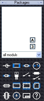
Layout with schematic
The list of packages shows all package proposals resulting from your schematic components in use.
Button ![]() sorts the list by alphabet, button
sorts the list by alphabet, button ![]() sorts the list by pins.
sorts the list by pins.
Drag and Drop
Now get the package in question (represented into your layout by drag and drop. Sure the library path needs to be set correctly otherwise TARGET 3001! can not find the package - needless to say.
Select component
Clicking M1 upon an entry opens the dialog "Select package" and allows a glance on the package prior to import. "OK" then imports it. You may select a different package here. Please take care of different Pin/Pad assignments...
Determine standard component
You may furnish the package pictograms by your own default packages for dragging and dropping them later to the layout.
Layout without schematic
In this case you will see in section "Packages" only the Pictograms which offer a certain default package. Just use it by drag and drop to the layout canvas. Choose a different package by clicking [M1] upon the appropriate icon. TARGET 3001! guides you automatically to the package family in question. Furnish a pictogram by your own defaults. Click [M2] on the pictogram you wish to reassign. The following menu appears:

The entry "Drag and Drop" leads you to this article you are currently reading. The entry "Select component" allows selecting a package from the browser. The entry "determine standard component" allows the assignment of individual defaults.
The pictograms have the following meaning:
.
