Gallery: Difference between revisions
No edit summary |
|||
| Line 76: | Line 76: | ||
If you directly click one of the grey words, the gallery gets rebuilt according to this tag. If you would like to take all tags into account, please use the button: "All Tags". Now the initial state is reached. <br><br> | If you directly click one of the grey words, the gallery gets rebuilt according to this tag. If you would like to take all tags into account, please use the button: "All Tags". Now the initial state is reached. The button Options allows the definition of the overall size of the words.<br><br> | ||
[[de: Galerie]][[en:Gallery]][[fr:Galerie]] | [[de: Galerie]][[en:Gallery]][[fr:Galerie]] | ||
Revision as of 16:08, 6 November 2013
Gallery setup
The tab Gallery is new in the component browser since version V16.5.0.21. It gives alternative to searches by words and values simply by using images. Often you don't know a certain name of a component but you have an idea how it looks like. Now the gallery is your tool. It consists of an image part (top) and a text part (below). A gallery image is nothing more than a predefined search which brings you close to the component type in question. Later you may narrow your search. In this respect a gallery image represents a predefined search request.
Image area
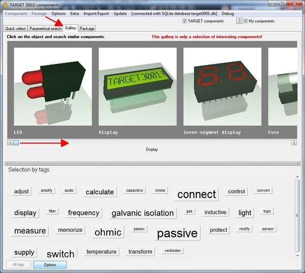
Image: The gallery.
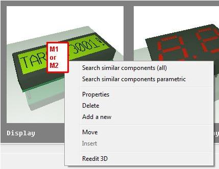
Similar parts are subsumed under representative images. A click on a gallery image opens a context menu with the following options:
Search similar components (all)
This option opens the component browser and lists all those parts represented by the gallery image. The default images deliver component types, for example LED, Display, Segment. You can define individual gallery images to which you can assign individual search routines, see.: "Add a new".
Search similar components (parametrical)
This option opens the parametrical search at the desired component type. Now enter parameters in order to narrow your search.
Properties
Every gallery image represents a certain search demand. Some gallery images are given by TARGET 3001!. You can not change them. others might be added by yourself see: "Add new". You can add properties to your gallery image for example the name or additional information. Both appear under the image. Also you can furnish a gallery image with a number of tags which then will appear in the text area.
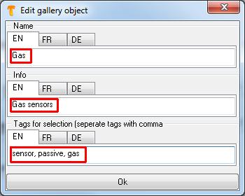
Image: Properties of your own gallery image.
Delete
Only self created gallery images can be deleted. Deletion is quick - there are no questions and no dialogs to confirm. But with the same speed you can create new gallery images representing a certain search demand, see next chapter.
Add new
This option makes the image of a 3D coordinate system appear in your gallery. It is titled <New>. At the same time the following dialog opens where you can define the name of this image, enter further information and tags for easier selection:
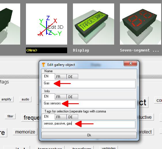
Image: Define properties when creating a new gallery image.
After appropriate words are chosen press the OK bar below. Immediately the terms are overtaken and a dialog opens:
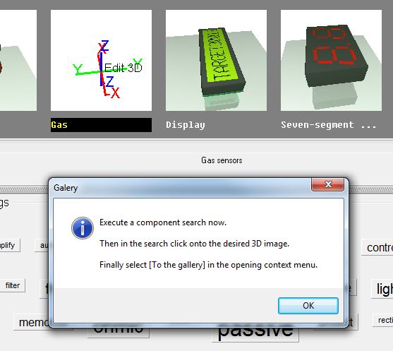
Image: A gallery image can be self made in three short steps.
Now do a "search", parametrical or quick search. The result of this particular search now is assigned like a default to the new gallery image. In our case we look in the quick search for the term "gas" in order to subsume gas sensors to the gallery. Select a gas sensor with a nice 3D image and click on the 3D image right below in the component browser.
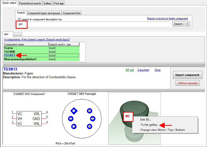
Image: At the end of the process the search demand and the designated 3D image are overtaken to the gallery.
A dialog confirms the fact that a new search demand together with a 3D image is assembled to the gallery.
Image: The creation of a new gallery object is done.
Now we switch over to the gallery and immediately see the result. For the fact that it is a self made gallery image its name is highlighted black.
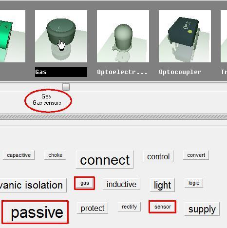
Image: The new gallery object. Oval: Name and information: Square: The tags, to which the image (= this particular search demand) is assigned.
Move
In order to move an image within the gallery please click it and use this menu option. Now click on the image prior to which the image in question shall be inserted. Now press the option "Insert".
Insert
In order to move an image click it and select menu option "Move". Afterwards click on the image prior to which the image in question shall be inserted. Now use function "Insert".
Reedit 3D
This option gives opportunity to edit the gallery 3D image. This has no influence on the genuine 3D image of the data base but only to the image in the gallery.
Text area
In the text-area (lower half of the dialog), see various terms which roughly outline component functions. The bigger the word appears, the more gallery images are tagged to this particular catchword. Every gallery image can be furnished with several tags. The word "passive" for example is relatively big. That means that many gallery images are tagged "passive". If you click a certain word and other words remain black it means that you additionally can click these words in order to narrow your selection. Example: click on the word "passive". Immediately it gets blue and the number of gallery images reduces to the ones being tagged "passive".
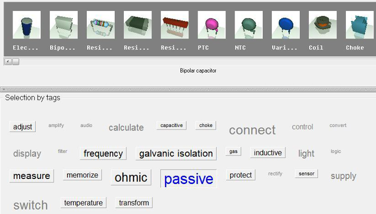
Image: The gallery of passive components
At the same time other words remain black, e.g. the word "adjust". If you now additionally click the word "adjust" the gallery shows "passive" component families being able to "adjust". Result:
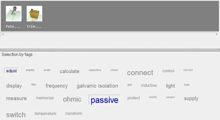
Image: Gallery of passive components and those of them being able to adjust something.
It is because Potis and Trimpotis are furnished with the tags "passive" and "adjust" (besides other tags).
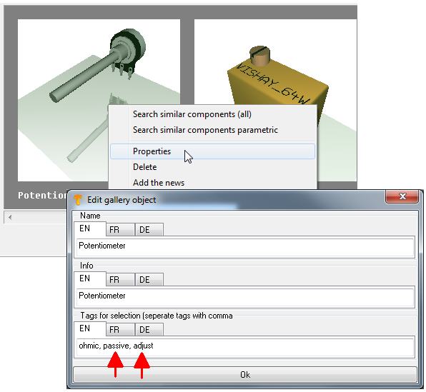
Note: You can not create this image, because you can't edit TARGET gallery images. Only self made ones.
If you directly click one of the grey words, the gallery gets rebuilt according to this tag. If you would like to take all tags into account, please use the button: "All Tags". Now the initial state is reached. The button Options allows the definition of the overall size of the words.
en:Gallery
